Showing posts with label vintage. Show all posts

Monday, August 20, 2018

Simply Succulent

 Hey, hey, hey!
Look who's guest designing for Aurora Wings!!
I am thrilled to be playing along with the amazing DT and being
a part (if only temporarily) of one of the best design teams out there.
Mitzi is an amazing artist to design for.
      
I have the extreme pleasure of working with one of the newest sprites,
the Succulent Sprite!! Isn't she just too die for? 
So beautifully rendered and on trend right now.
The current challenge is a sketch, which I find so helpful with designing.
Takes most of the guess work out of it for me. I tend to get caught up in the 
minutia of laying out a design, more than anything.

I used quite a few reference photos of succulents to choose my palette,
which was nearly the death of me. Sooo many options, but not sure how to 
actually achieve what Mother Nature painted so beautifully with my
measly old Copic markers. I managed to pull it off pretty well, I think.
I love how the clear Nuvo Drops give such great texture to her String of Pearls.

After I finished coloring and embellishing her, I started working on the background.
I glued a sheet of burlap to a corrugated cardboard substrate, and gessoed the entire
piece. After it was dry I used a stencil and some crackle paste to add interest and depth.
Once dry, I spritzed it with Lindy's sprays hoping to capture some iridescence on 
the crackle. I think it looks like lace for the most part, which adds to the
shabby chic feel I was going for. 

Following the sketch, I arranged my flowers, doo-dads, and pearly bits
around the colorful focal image. With the addition of an easel back, this
creation is complete!
I do hope you'll pop over to the Aurora Wings Challenge blog to see all of the
inspiring projects on display for this challenge. You just might be inspired to play
along and possibly win yourself some AW gold!

I'd love to enter this project in the following challenges:


Sunday, May 6, 2018

Let me introduce you to the Gent

Man, where does the time go? Seems only yesterday I was trying
to get back into creating and blogging more often. Then, radio silence.
Well, I'm back! 
This time I should be around a bit more often since I am on the newly
supporting and creating art using the current line of stamps created by 

I chose to start by creating an insert page for my art journal.
I picked up a pack of these from Tuesday Morning on the cheap. 
They came in three different colors; manila tag, black, and kraft. 
I had the bright idea to use a black page, and then I heat embossed The Gent 
image with black powder. Now, how the heck was I gonna color this thing?!

I decided to give it a go using some Stampin' Up watercolor pencils.
Since my selection was limited, I was challenged to come up with a flesh tone.

I ended up using browns, oranges, yellows, and white. 
Not sure it worked all that well, but it does convey a flesh-ish tone.   
It toned down quite a bit once I used some water to blend it out.

I created the background using Distress Oxide inks.
I love these inks. They blend like buttah, and I love the
oxide effect that is achieved simply with water.  

 I have a bunch of mustache brads that I rarely use, so I was
determined to get one on this project. I used it to cross the "t". 
Pretty cute, if I do say so myself.

I added some washi tape and hardware to the upper corner.
I tried to keep it pretty flat along the left hand side as it will be added 
to my art journal, which already has issues closing.

 I added some silver gear die cuts, and broke out my Distress crayons
to add distress and grunge all over the place. I love the black crayon. It's perfect
for adding dimension and shading on projects like this.
Lastly, I added black and white splatter to give an over all cohesiveness to the page.

That's it for me today.
Be sure to pop by the SpeshInk blog to meet all of the new DT talent, and
prepare for the next installment of art made with these awesome stamps.

Tuesday, June 7, 2016

Alice in Wonderland Mixed Media

I have been a fan of the artwork of Sarah aka Star
for quite some time. Like many years ago when I first saw her 
Chibi artwork on the Spesch Designer Stamps site. 
Now she has her own shop selling her awesome artwork directly at
I had to grab the Alice in Wonderland images and make something 
cool with them, so I made a wall hanging that I'm pretty proud of.

I am super happy with how this turned out.
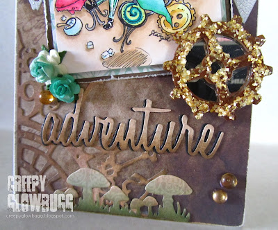
I began with a drawer insert I had that served as a perfect substrate.
I gessoed it and adhered some distressed vintage feeling designer papers. 
Then, I stenciled some diamonds on it using Finnabair platinum crackle paste,
keeping it kind of random. 

I colored up the adorable Alice image in blue greens and beige shades
of Copics. I added in some gold tones and a hint of red, too.
I matted the image onto some distressed background papers to add more texture
and contrast.  

I used some metal embellishments along with various die cuts from Tim Holtz.
I covered the clock and gear die cuts with Golden Pearl Mica Flake and colored it
using TH distress inks. I also used some gold and amber shades of dew drops, 
and some hand colored paper roses in blue greens, as well.  

Then it was the Mad Hatter's turn to get some
color. More beige and blue green shades of Copic coloring.
I added some pops of red to give some nice contrast too.

More die cuts, roses, and dew drops were added to finish it all off
and provide some balance to the entire piece.
I made this for my bestie and she loves it. It now hangs in her craft room.

Thanks for dropping by today.

I'd like to enter this wall hanging in the following challenges:
hope it's not too cute for you guys


Thursday, October 1, 2015

October 1, 2015: And the race is on!


Today is October first. The day I anticipate every year, yet I am 
never quite ready for it to begin. This year is no different, except I 
was smart enough to know I wasn't going to be able to participate in 
the usual October festivities like The Countdown to Halloween,
or the 31 Days of Halloween. I knew I didn't even want to try this year.
Last year the stress almost killed me...

Today being the first, is the start of the new challenge at Smudgy Antics.
The theme is always Anything Goes as long as you use a Smeared Ink image.
No other rules apply. 

I am working on my repurposed children's board book.
These are wonderful substrates for a multitude of mediums
and techniques. Not to mention, they are stupid cheap at thriftstores
and yard sales.

I decided to go in an unusual direction for me by using pretty much
only black, white, and silver for this layout. The dp set the stage being
gray and white. The vintage images lent themselves to a muted palette as well.

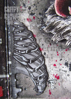
I used the Anatomy 101 Ribs by cutting them right down the middle. 
I used black soot distress ink and made it blend into the dp better.
Then I highlighted the ribs with a white Posca paint pen. 
I really like how this turned out.

How can you not love these guys?
They are only two of the fifteen bat images available in the
A Little Bit Batty set. It was hard to choose just two. 

Here's the other side of the rib cage, along with a TH rub-on.
The red, black, and  white splatter really sets these images off quite nicely.

Bat 1 from the A Little Bit Batty set, some more rub-ons,
and a small medical ephemera.


This made me giggle a bit. I used the Profile Head from the 
Gross Anatomy set, and matched it with a card meant for tasty
Halloween treats. I like it better used this way. 

That's it for me today.
Be sure to stop by the Smudgy Antics challenge blog and check
out all of the other inspiring projects to whet your October appetite. 

Monday, August 25, 2014

Vintage Smeared Ink DT Hop

Another month has flown by, and we find ourselves face to face
with yet another inspiring Smeared Ink monthly DT hop.
This month the theme du jour is
Vintage.

I have been in a bit of a Hallowe'en colored mood for a while now,
so this has given me a nice departure from my standard varied shades
of green, purple, and orange.

I decided to make one of the corsets from the Heavy Metal digi set
my main attraction on this card. I colored it with E80 Copics and
a some RV90 shades. I also tipped the lace with the same RV95 Copic
that I used on the corset.     

I used a Vintage definition stamp from parts unknown. 
It was perfect for this project. I attached it with a tiny TH paperclip.
I also added a wood cut key from The Porkchop Show on Etsy. Love his stuff!


Thanks so much for dropping by today!
Below is the hop list if you'd like to check out all of the 
marvelous makes for today's hop.


CREEPY GLOWBUGG - you are here


Thursday, July 25, 2013

Je m'appelle Creepy Glowbugg

Oui, oui! I'm feeling kinda European today, after I got all of my
French themed craft paraphernalia out to play with.
I have been wanting to play along with this month's challenges
over at Stampotique Designers Challenges, but the month has 
gotten away from me, again.  Now I have to make up for some
lost time.

After compiling my supplies, I felt that my dear old,
Kolassal, would best fit the French Flair theme.
Must have been the top hat. Or the bad teeth.

After coloring Kolassal with an aqua painter and TH Distress Inks,
I fussy cut her out, and added her on top of some distressed panels.
I used a harlequin and a fleur de lis stamp on the kraft base card.
I used the water brush to distress the Harlequin pattern and give it a
water colored look.   

 Lastly, I added the linen tag after Distressing it with inks.
I added a copper tag (distressed with Distress paint), some brads and 
some seam binding for the tag.

Voila! 
I would like to enter this card in the following challenges:


Thursday, January 24, 2013

See! I can do it too!

As part of my new outlook for 2013, I'd like to 
start entering more challenges.
Unfortunately, sometimes my 'style' of paper crafting isn't 
fit for mass consumption.  
I am far from a conformist, but I do want to play with 
the big, fancy dogs (sorry ladies) on occasion.
Which means I have to 'fluff up a bit', and make pretty things. 
I can do this. Watch me! 


I have been wanting to play along with Kenny K challenges
but haven't been in the right mood. 
His images call for a bit of work to color in all of the details, 
and then the actual card has to be just as detailed (in my mind, anyway).

So, when inspiration hit, I started with this image.
As if she wasn't self explanatory, her name is "Warrior Princess".
She's pretty bad ass, huh? Even with pink hair.

Then, I broke out with my terribly underused, pretty things.
Roses I colored to match my color scheme, a metal heart brad, lots of 
half pearls, a pearl stick pin, and some fancy pearled sprigs.

Yes, I did own all of this pretty schtuff prior to my life as a 
creepy chick crafter. Funny, how personal styles change. 
I admire this style of crafting immensely, and try to imitate it
in my own work when it seems fitting.

LOTS of dimension on this project. 
This will definitely need a padded envelope when it's mailed.

Ta dah!
I always have trouble with the whole "less is more" concept,
 but I think I stopped just in time on this one. 
I really enjoyed this project, and adore the way the card turned out.
I can make pretty things, too!   

I'd like to enter this in the current Vintage challenge at Kenny K. 

Thursday, September 23, 2010

Stampotique Vintage Challenge

It has been quite a while since I have carved out some time to
just create whatever I want with whatever images I want.
Once I saw the current Stampotique challenge was "Vintage",
I decided to play along and maybe, just maybe I'll be
a randomly drawn winner of a $30 Stampotique gift certificate.
Mr. Torrente has come out with some new images that I cannot afford right now,
so a gift certificate would be nice. 

 
I have had these two Daniel Torrente images in my
possession for far too long without inking them up.
Well, actually they have been inked up, I just never
made anything with them.
I have had "BatBoy" for well over a year and the cat was
obtained this year.
I dunno what I was waiting for.
This challenge maybe?

I thought this was a fitting sentiment.
I typeset it myself and heat embossed it right
outta the printer.
I've never done this before with a digital image, but aside from
a big 'ol mess, it worked quite well.

Keep it creepy!!

Thursday, June 24, 2010

Toe tag! You're it! The Burtonesque Dolls Challenge #8

The shock is just starting wear off regarding my recent invitation to
join the Burtonesque Dolls.
I am finally all set up and ready to play!
This week's challenge was to create a toe tag
inspired by Burton's "Beetlejuice".
I have some really cool images from a guy who calls his
company Meer Image. His last name is Meer. Cool huh?
I never think to use these stamps because they are so strange and not really
fitting for most 'greeting cards'.
I managed to work this cool "Return to Sender" image in for my toe tag.
   
And then there is Pearl.
She is one of my favorite Daniel Torrente images (thanx Barb!),
and something about her reminded me of the scene in Beetlejuice where the wedding couple is hovering over the dinning room table.
Must be the slack in her hands and the gaunt look on her face.
Okay, now let me 'splain the pearls on her neck.
I started off using Liquid Pearls on her necklace, but smeared them before they
were dry. This left a shiny, sparkle to her neck and I was unable to color it any further with Copics due to the finish the LP left.
Sooooooo, I added the over abundance of pearls to cover her
shiny decolletage.
I guess it works. It definitly looks better than before I added them. 

Friday, June 18, 2010

2 down, 3 to go

My friend, Dani, asked me to make her Dad
 and her brother, Father's Day cards. 
I made her Dad cards last year with the same Chicago Bears theme.
This time I went more with the animal aspects.
I also found a photo of the old Soldier Field, and I added a ton of
clear, thick, embossing powder to it, and cracked it up a bit.
Dani's brother, Robb, is a first-time Dad this Father's Day, and a huge Vikings fan, 
so hence, the purple and yellow color scheme.
I did find this vintage Viking mascot, which I thought was pretty cool.
I used the same cracked glass technique on this as well.

If I make cards for these guys next year, I'll have to come up
with something new and original.
I'm over the whole football thing.