Monday, June 30, 2014

Smeared Ink Monthly DT Blog Hop

Welcome to the June installment of the 
Smeared Ink monthly blog hop.
I can hardly believe that it's already summer.
Moreover, that it's almost July 4th! 
Time really flies when you're an old lady!

Anyhoo,
here is my card using one of the awesome "Llorona" images available exclusively
from the Smeared Ink Rubber Club. Well, they haven't been released just yet,
but since I'm on the DT I get the perks of playing with the new releases early.
[insert shit eating grin here]
     
I struggled to make this card. I tried to force some cool Day of the Dead
dp on this project, but there was a shade of green that just wouldn't play nice
with all the purple. I scrapped it finally, and just kept everything in shades of purple
and black. So much better! 

I broke out with the pearl stick pin and a handmade headstone embellie.
I need to make more of these. That is one of the best Martha Stewart
punches in my collection. Next to the drippy goo punch. That one is a
definite must have for any creepy crafter.   

Be sure to check out the entire hop with these handy links.
 photo DTButtonApril2014_zpsfa628662.jpg

Thursday, June 26, 2014

Creepy CAS

I have always struggled with the whole "less is more" ideal. 
More is always bedda! Right?
Well, maybe not always, but usually I opt for more.

This is my version of clean and simple.
I'm not sure if there are any specific rules for CAS, but
I have a feeling dp might be on the no-no list.
I'm such a freaking rebel.

I have the extreme pleasure of being on the Smeared Ink DT,
so that means I get to play with new releases before they are  
available to the masses. This image is from the new rubber only
release at Smeared Ink. It's called, "Llorona".  

This is the left side of the image. Very cool, huh?
All colored with Copics, and highlighted with a white Gelly Roll pen.

You know you want this set of deeply etched, red rubber stamps, huh?
Check out the deets of the Exclusive Rubber Club here

Here is my fancy schmancy embellishment.
I bought a sheet of those rhinestone clusters and have had them
for years. It's nice to occasionally remember to use my cool crap.

Thanks for stopping by today.

Keep it creepy!! 


Tuesday, June 24, 2014

666: The Number of the Beast

I am so very proud to be a Haunted Design House Minion.
It is quite an honor to be a part of such a talented bunch
of like minded artists. And it is an even bigger deal that we, as a team,
have reached 666 followers over on the HDH challenge blog.
I'd like to think that people follow our challenges because the themes are 
unique and cater to the "dark crafter". And because we provide such
incredible, awe inspiring samples to sow the seeds of inspiration for each
and every challenge.
We have reached a milestone that others may find unsavory,
but in the dungeon, if it's unsavory, we savor every last bit of it.   
We don't appeal to everyone, and that's what makes us so
appealing to others, and ourselves. We are rather proud of our
reputation for the distasteful and the wicked. 

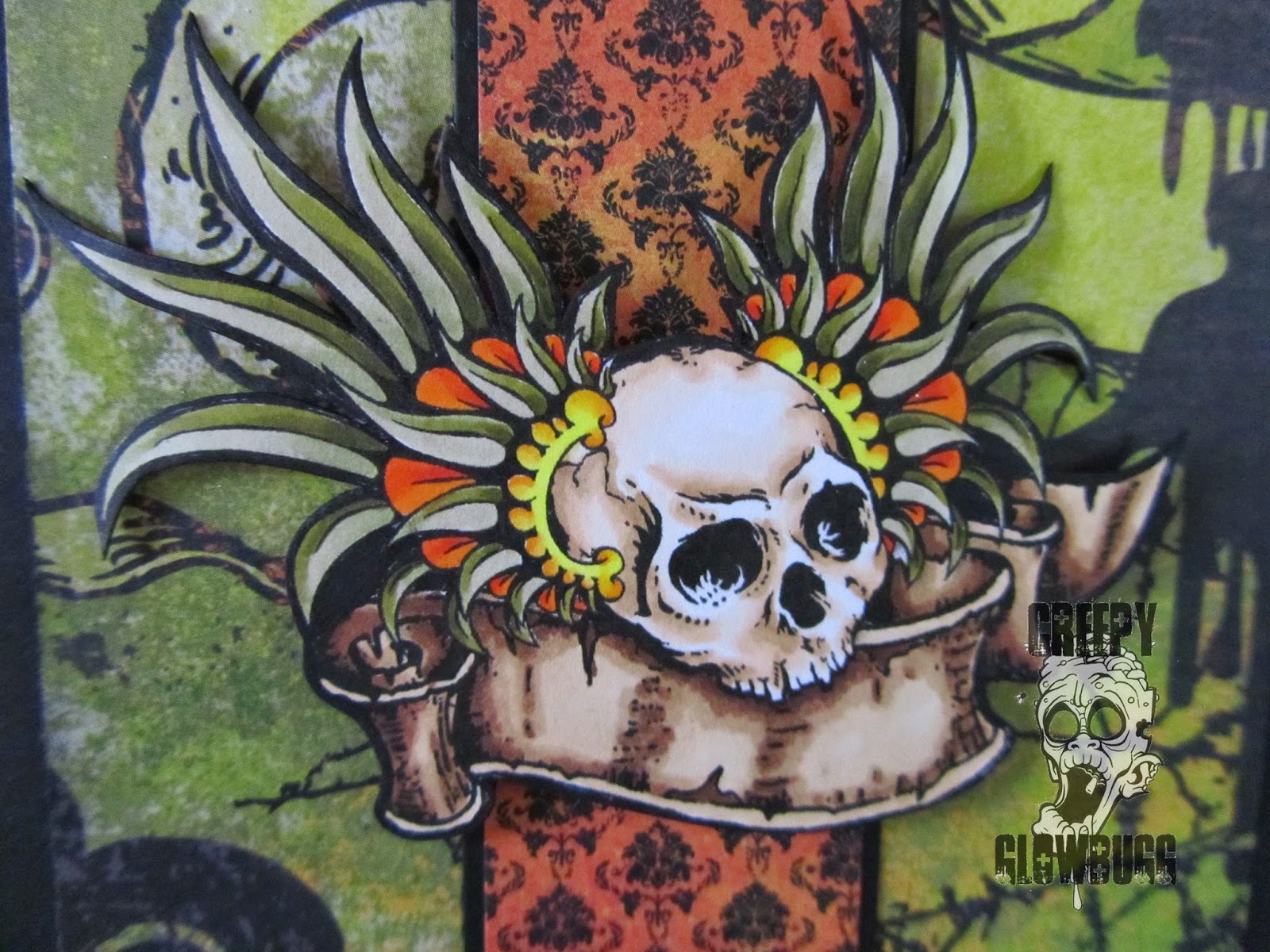
Okay now it's time to share my make for the 666 challenge.
At first I wanted to try and recreate Derek Rigg's Iron Maiden 
cover art from The Number of the Beast album, but that didn't work out.
At all. I am no where near talented enough to sculpt Derek's work.
Learned that the hard, and time consuming way.
So I opted to go a bit more simple in my design.

I considered using my own Hello Kitty tattoo for my reference art.
But decided to go with something a tad more original. And a bit less cute.

Here is my reference photo for my "Hello Darkness" sculpt.

I started out with a 4" x 6" base of polymer clay.
I decided to work a bit larger than my previous relief sculpts.
I was also hesitant to work with such an iconic image as Hello Kitty,
because if  it is too "off", it will be a huge fail (see first attempt at the Derek Rigg's art).
I've seen too many tattoos, and counterfeit products with a wonky ass Kitty on them.
No bueno. I think I did okay though... 

Started blocking in the color with acrylic paints after
Kitty got roasted for 35 minutes at 275 degrees.

Almost done. 
Screwed up the eyes, so still need to fix that.

The flames turned out pretty killer. I added some glitter paint to the 
flames to give 'em some sparkle. 

Ta dah!

I (sorta) fixed the eyes to match the eyes of "Darkness", 
from the film, "Legend".

Overall, I am pleased. How about you?

I would love it (and the other Minions, too) if you would stop by
the HDH blog to check out all of the incredible artwork that the
we made for this special challenge. We also have a bunch of wicked cool 
prizes to be won if you are brave enough to join us for our special occasion.
See ya there!


Friday, June 20, 2014

Llorona in rubber

It's not a naughty as it may sound.
It's actually a new release in rubber
With the onslaught of digital images (which I also love, now),
it's nice to get inky with some new, exclusive designs in rubber.

The new set is called, "Llorona", and is 
only available through the rubber club. 
It is an exclusive to the club release, 
and will never be released as digital images
Got it? If you like these images, please sign up for the
Smeared Ink Rubber Club. You won't be disappointed.

I am quite pleased with  myself here. While this is a big departure from
my usual color scheme, and overall feel, it is still beautifully haunting and vintage.
I did hit all the edges with frayed burlap distress inks for a uniform color and 
aged effect.

I am getting so much use out of my new Bow-Easy.
I find myself adding bows to everything now. Well, almost everything.
My hand tied bows used to suck out loud, but now they turn out 
perfect, every time. Best $5 I ever spent. Just sayin'. 

I used papers from the "Lost & Found Two" pad from MME.
It is so much easier to use the papers from the same set, as opposed to 
trying to coordinate scraps, and misc. papers from my stash.
I'm learning. Slowly. But, I'm learning. 

I've got a couple more samples for this release coming soon. 
Be sure to stop back by to check 'em out.

I'd like to enter this card in the following challenges:

Monday, June 16, 2014

Aurora Wings "No lines" challenge

Happy Monday, if that's possible.
I have a cool card to share with you today.
I made it for the new challenge at Aurora Wings challenge blog.
The new themes are either, "no lines coloring", or color bingo.

As you can see, I went with the "no lines coloring" option.   
I have colored with this technique a handful of times, and I still find
it quite the challenge. But I enjoy pushing my coloring abilities with
new techniques.  I think the key to "no lines", and all coloring in general,
is contrast. Make sure your images cover the spectrum of the darkest darks,
to the lightest lights, for a full dimensional feel.
Now that I see my owl up close on the monitor, I see where I need to go back
and add some white highlights to help with dimension.
I did add teal tulle behind the owl to give him some contrast from the
black diamond shape behind it. 

I broke the seal on my Graphic 45 Steampunk Spells 8 X 8 paper pack.
I've had it for months, but was never sure it fit the project I was working on.
This works, for sure. 
I colored the awesome Aurora Wings Steampunk Owl image 
using Copics in mainly E19, E09,YR08, YR07, YR04, Y38, Y35, and Y13.
I was trying to achieve a metal copper/golden appearance.   

I added the Alice's Clock corner die cut from SCACD, and highlighted it 
using Mercury Glass Stickles.  

Some dew drops in gold, with Mercury Glass Stickles added for fun
and interest.

The papers are much busier than I am used to using together on one project,
but I do like it. Maybe a black ribbon to break it up in the middle? 
I'll be here all day trying make this better. Better just leave it... for now.

Be sure to stop by the AW Challenge blog to see all the incredible art from
the talented DT, and maybe even challenge yourself with one of the themes.

I'd like to enter this card in the following challenges:


Saturday, June 14, 2014

Happy Daddy Day

I am blessed to have three Dads to acknowledge on this day.

I made this card for my Dad.
I used the Time Traveller, and Simple Sayings stamps 
from Stampers Anonymous by Tim Holtz.

My Dad has really embraced the life of a widower, meaning he
has really started living the life he's always wanted. He bought a second
home in Wyoming, and he's traveling to England (for the first time) next month.
He is lonely, but he's not letting that stop him from enjoying his life.
I admire that.

Same basic card for my awesome Father-in-Law #2.
I colored the gent with Copics, and cut him out with an oval Spellbinders die.

I used a clear stamp from (the now defunct), There She Goes stamps -
Flava Sava set. I am so glad that I stocked up on the sets I had been wanting
when they announced they were closing shop.

Lastly, this one is for my FIL #1.
I was still on the Steampunk-y vibe, but since my FIL
just shaved his entire beard and moustache ensemble,
I went with a less facial hair focused card.
This little guy is from Stampotique

I used some Tim Holtz letter tiles to spell out, "Pop", which is
what my husband has always called his Dad.
Moreover, I wanted to show off my fancy schmancy double bow I made
with my new Bow-Easy template/tool. The best $5 I have ever spent! 
Works like a champ every time.

Thanks for dropping by today. 


Monday, June 9, 2014

Bubble, bubble, toil, and trouble....

has a recipe challenge you simply must try!

Take equal (or lesser) parts black, green, and purple.
Sprinkle in a flourish or two.
And top it off with a dash of something metal.
Sounds delish, don't ya think?

I used this great digital image from Sweet Pea Stamps called,
"Rose", by Concetta Kilmer.
I colored her with Copics, using the colors from the recipe. 

I chopped up some webbed ribbon and fashioned a ragged frame for 
the main image. I added the metal rose brad to balance it all out.
  

Remember to drop by the HDH blog to see this week's inspiration pieces
from the illustrious Minions.

I'd like to enter this card in the following challenges:


Elegantly beautiful Memento Mori

I have a beautiful new image and card to share with you today.

Today is the new release of this image called, 
Memento Mori, from Aurora Wings.

I decided to deviate from the classic orange or red poppies,
and went with purple. Since these are the Opium variety, I thought
something more decadent was in order.  

I even broke out with some sparkly bling for the occasion.

And I used my new Morticia Addams quote stamp from Riley and Co.


Thanks for dropping by! 
Be sure to check out all the different looks that can
be achieved with this image at the Aurora Wings Showcase blog.  
The design team have really outdone themselves with this new release. 


Friday, June 6, 2014

Smeared Fringe

Greetings!
I am here to share my weekly make for Smeared Ink.
I always need blank note cards, or a blank all occasion card,
but always seem to have used my last one already.
So, I decided that now would be a good time to add to my
stash of blank cards.

I have used two of the images from the versatile set of digis named,

This guy is called, Fringe 1.
He strikes me as not only masculine, but Aztec in origin.
Must be those great feathers and headdress.
He'd even make a good Father's Day card for the edgier type Dad.

After coloring him in yellow greens and oranges/yellows, 
I fussy cut the image and popped it onto the front of some
Hallowe'en themed dp scraps. I even managed to destash some
orange acrylic dew drops, too. Score! 


I decided to go in a completely different color direction for this one.
This guy is called, Fringe 4.  

Since I have a stupid amount of Tim Holtz Idea-ology hardware and 
sctuff, I have been hanging onto the package backing on most of the products. 
The thought being that I can reuse it in any of my numerous paper crafting adventures. 
I finally incorporated a backing card into a project! One down, 25+ more to go!
I also added a couple of Sizzix die cuts with some heat embossed 
Frantage for a little bling.
Perfect for a Father's Day card, too!

 I'd like to enter these cards in the following challenges:

 Thanks for dropping by today.


Wednesday, June 4, 2014

Having a mainstream moment

Contrary to my popular belief, not everyone likes weird cards.
So every so often I am challenged to create a mainstream card
for family birthdays and special occasions.

I adore this image called, Retro Girl 3
I am a huge fan of Torico (of Birdie Brown), who now designs exclusively 
for My Favorite Things. She used to sell her images on Etsy, 
but unfortunately, she closed her shop when things picked up at MFT.
Glad I stocked up on her digital art when I had the chance. 

I made this card for my SIL. I colored her to resemble Dana, too.
She has three boys under 12, so I imagined her sitting alone and 
enjoying a cup of tea/coffee for her birthday. 
I bet she imagines that scenario as well. 

I'd like to enter this card in the following challenges:

Thanks for dropping by today.
Hope I didn't frighten my creepier fiends with this one.
The darkness shall return momentarily.....