I have always struggled with the whole "less is more" ideal.
More is always bedda! Right?
Well, maybe not always, but usually I opt for more.
This is my version of clean and simple.
I'm not sure if there are any specific rules for CAS, but
I have a feeling dp might be on the no-no list.
I'm such a freaking rebel.
I have the extreme pleasure of being on the Smeared Ink DT,
so that means I get to play with new releases before they are
available to the masses. This image is from the new rubber only,
release at Smeared Ink. It's called, "Llorona".
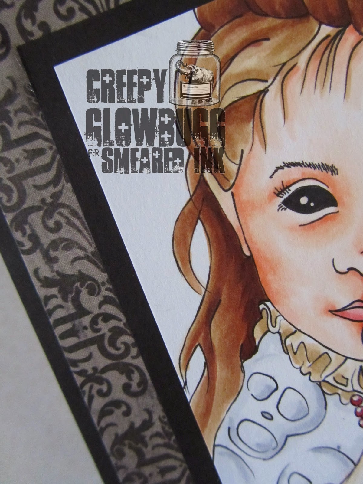
This is the left side of the image. Very cool, huh?
All colored with Copics, and highlighted with a white Gelly Roll pen.
You know you want this set of deeply etched, red rubber stamps, huh?
Check out the deets of the Exclusive Rubber Club here.
Here is my fancy schmancy embellishment.
I bought a sheet of those rhinestone clusters and have had them
for years. It's nice to occasionally remember to use my cool crap.
Thanks for stopping by today.
Keep it creepy!!


It IS very cool. Love the embellishment <3
ReplyDeletehttp://skullsneyeballs.blogspot.com
Fabulous card you made and it looks CAS to me, no necessary decorations just image and background! :)
ReplyDeleteHugs, Elenor