Showing posts with label purple. Show all posts

Thursday, June 18, 2015

Pocket Letter Newbie

I have officially participated in my very first Pocket Letter swap!!
I loved how fun and simple it looked, so I started collecting all of the
"ingredients" to begin making my own. But you really do need someone to
swap with to make it official. I happened to be chatting with my dear friend
(in real life), Dani, who stated that she has been trading pocket letters all
over the US and Internationally for a few months. What?! How did I not
know this?! I made sure she was my first PL swap, although I still haven't
received mine yet....

I went with a purple Goth theme which I chose myself. I guess you can
pick a theme between you and your trade partner, but Dani left it up to me
since it was my first time. I know she doesn't "do pink", so I went with
purple. Everyone loves purple, right? Well, they should!

I began by grabbing a stack of trading card sheets from my ATC stash,
and pulled out my ridiculous amount of ATCs that I have made, but never
gave away. I have a lot! What a great way to share them with new friends far and wide.

I was lucky enough to have won some Bugaboo images from a recent LOC challenge,
and really wanted to color them up. I love this spider hanging from the moon.
I colored it with Copics and then clear embossed a spider web over the entire card
before using Distress Inks to color the background. 
Then the fun really begins when you start adding goodies to every pocket. 
I added a bunch of paper punched spiders to this pocket.   

After filling the pockets with ATCs, and blank coordinating papers,
I added rhinestones, bows, glittery border strips, puffy bat ribbon, etc...
Basically, add fun crafty stuff to share. I guess the original idea is
to add a tea bag, a note about yourself, a fun quote, and all kinds of 
ephemera. There is a great introduction to Pocket Letters here,
by the lady who created them. 

This one was fun. I just added some Tim Burton-y paper clips, and
a bunch of punched bats, and teeny neon clips, too.

This image was fun to color and play with. I got a bit over zealous with the 
polka dot background, but it's very fancy now.

Dani loved her Pocket Letter. I am going to the post office to retrieve mine today.
And pay to get it out of hock. Make sure to add the correct postage, and that it's
packaged properly when you do your swaps. I'm sure Dani did as well, but 
apparently my local post office is super persnickety and wants special handling
fees or something.... Of all the swaps Dani has done, both in the US and Internationally,
this is the FIRST one to have issues. And we only live about 10 miles apart.
I am such a unique experience.  


Monday, August 4, 2014

Deja-Vu Doo for Macabre Monday

Happy Monday? No. 
Maybe not an especially happy Monday, but it is Macabre Monday, 
and that means the second week of the theme 
Deja-Vu Doo has begun.
The challenge is to revisit a relatively recent project or supply
and use it again, but in an entirely new way.

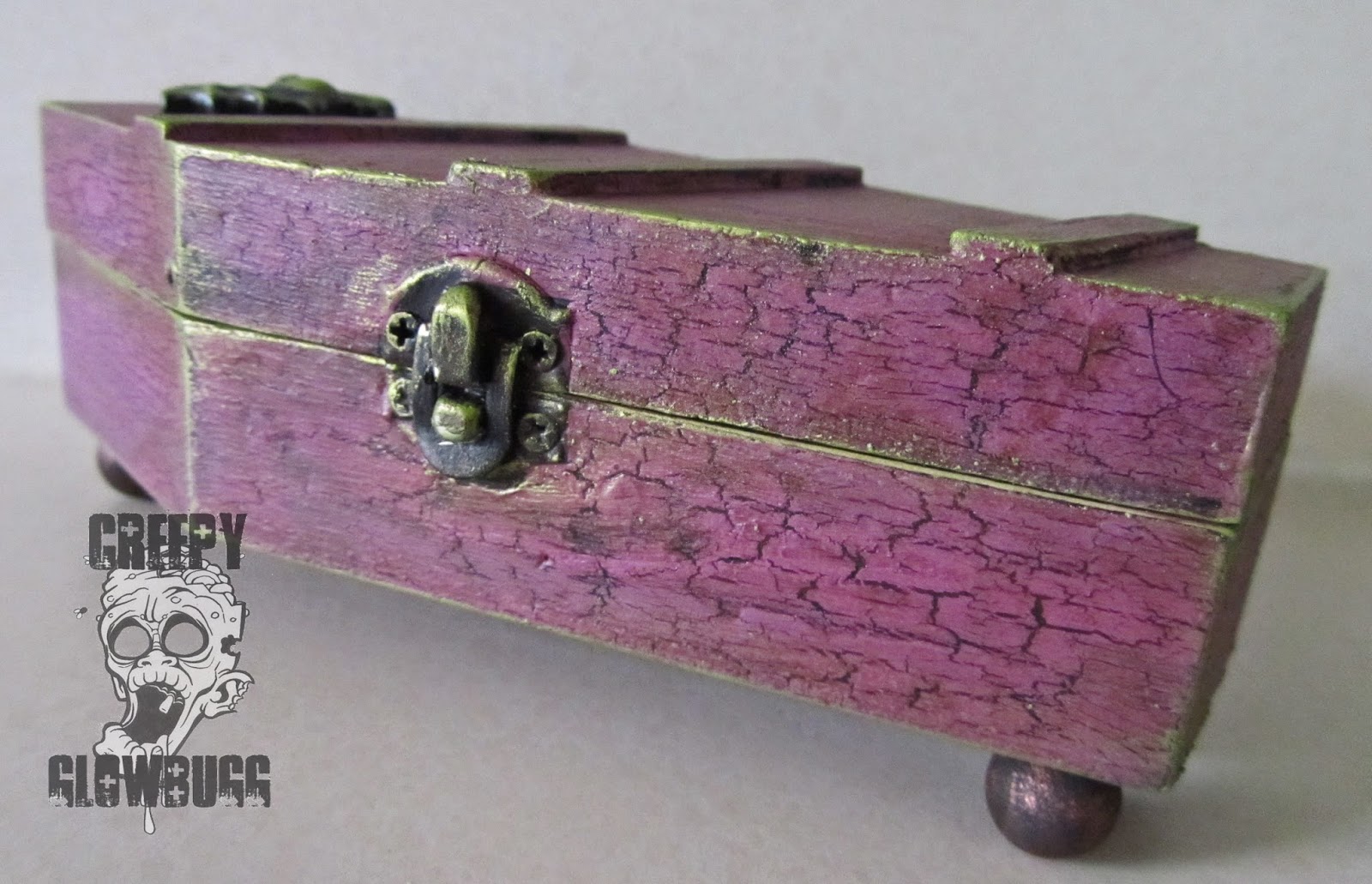
I decided to try my hand at another altered box.
I made this one a few weeks ago, in case you missed it. 
This time I went with a hinged coffin box made of wood.

I sealed the blank wood box with Americana sealer from DecoArt
before doing anything else. I've learned that this is beneficial to the overall
effects I am trying to achieve here. 

Next, I painted the box with a black acrylic paint. I applied two coats of the black
paint and let it dry completely (with the help of a heat gun), before applying the
Weather Wood medium. I used this project once before but didn't get good results.
Now I realize I misread the directions the first time, but I got it right this time.
The key is to apply a nice, even coat of the WW medium, ending up with a nice,
glossy finish. Let that dry completely. Try to be patient and let it dry by itself to avoid
burning the paint or the medium. Ask me how I know this....  

Once the Weathered Wood medium has dried completely, I chose a highly
contrasting color of acrylic paint. The key to getting a good crackled finish
is to apply a thin coat, quickly. And try not to go over the areas you have already
painted, as it decreases the crackled effect. Work fast, and in the same direction
as the wood grain. 

As a side note: I have had this paint for 17 years....

Once it was all dry, I was thrilled with the weathered effect, but that paint
color was just too garish, and bright for this coffin box.

So I made a wash of watered down brown paint,
and applied it, and wiped it off almost immediately, leaving it in the
recesses of the coffin for an aged effect. I think it toned that purple
down nicely. 

I still felt it was lacking a bit, so I added some
Inka Gold Metallic Rub in green yellow to all of the edges.
This really made it all pop.

I glued a bat I made (using polymer clay and a Martha Stewart mold)
onto the front of the coffin. I like the simplistic look of it. Since there is
so much going on with all the textures and layers, this felt right. 

I glued some wooden balls to the bottom of the box for feet.
I think this makes it feel a bit more special than just a box that sits on it's bottom.

I decorated the inside of the box using various collage cuts from
Itkupilli and random stuff from my stash. 

It felt like something was missing, so I added some Tim Holtz Halloween rub-ons
to the edges of the box.  

Yup, that's what was missing. I like it. 


More rub-ons, and green metallic rub.

That's it for me. 
Thanks for stopping by today.

I'd like to enter this box in the following challenges:
Allsorts Challenges - Favorite Things
Halloween is my favorite thing in the entire world.
I bleed orange and black, 24/7.


Monday, July 28, 2014

Smeared Ink July DT blog hop

Well July seems like just a blip on the map this year.
I can't believe it's almost over already.
The end of the month brings us the 
Smeared Ink DT Blog Hop
So that's a good thing, at least.

The theme for this month's blog hop is
MONOCHROMATIC.   

I chose to work with purple hues. One of my very favorite colors.
I used my new rubber stamp called, "The High Priestess"
from the Morbidly Adorable rubber set, 
sold exclusively through the rubber club at Smeared Ink.

I was so excited to ink up my new rubber, that I didn't really 
consider just how much coloring was involved with this image.
Let's just say it was a bit of a marathon coloring session. 
And a bit of a challenge to keep it all monochromatic. I did cheat a teeny bit by
using some RV pinks to give some contrast to the wings, ball in her hand, and 
the beads in her hair.  
  
Love the skellie kitteh!

I used a white Sakura gelly roll pen to add some highlights.
The highlights help with contrast. I can't express how important
I feel contrast is to successful coloring. You have to have super darks
and super lights, coupled with all of the shades in between for a nicely
colored image. Regardless of whether it's full color or monochromatic,
there should be a full range of  hues to show depth. 
In my opinion, anyway.  

Lastly, I've added a sheer purple bow for some dimension and interest,
given how simple the card ended up. I felt it only
detracted from the image to add any embellies or other crap. 
Sometimes I forget that less is more. Usually, I forget.

Thanks for dropping by today. 
Please feel free to hop along to the rest of the design team's 
blogs, and check out their amazing monochromatic makes. 

Monday, June 9, 2014

Elegantly beautiful Memento Mori

I have a beautiful new image and card to share with you today.

Today is the new release of this image called, 
Memento Mori, from Aurora Wings.

I decided to deviate from the classic orange or red poppies,
and went with purple. Since these are the Opium variety, I thought
something more decadent was in order.  

I even broke out with some sparkly bling for the occasion.

And I used my new Morticia Addams quote stamp from Riley and Co.


Thanks for dropping by! 
Be sure to check out all the different looks that can
be achieved with this image at the Aurora Wings Showcase blog.  
The design team have really outdone themselves with this new release. 


Saturday, September 22, 2012

I'll admit it.

Okay, I'll just admit it. I am smitten with Rick St. Dennis' images.
I can't help it. He has the most amazingly drawn digital images.
But mainly, I am drawn to his Hallowe'en designs, and now he has some incredibly
wicked Christmas characters that are to die for!
I just picked up 5 new images today, so keep an eye out for some amazing
RSD eye candy colored by yours truly. 
 
Say hello to my little fiend, "Dear Aunt Spidey".
Isn't she delightful? 
I colored her with Copics and tried to keep her nice and bright.
In retrospect, I should have used the fluorescent purple as well.
Might have made her a bit more radioactive looking.
 
I used various webbed papers and a EK web punch in keeping
with the spidery theme. 

Finally, I added some orange rhinestones along the border and
in the center of the main web.
Fancy.
 
for some awesome designs for the coming holidaze!!


Thursday, September 20, 2012

Such a sucker

That's right, I'll admit it.
 I am a sucker for a cute face. Total sucker if that face is fuzzy.
 
I have been collecting 2 Cute Ink's images for a while now.
I started off with a couple of sting rays, and then a bunny, and then
came the little monster digis. Oh yeah, a cute and fuzzy monster!!
 
Oddly enough, I am using the current (for a very short time) freebie
available over at 2 Cute Ink's challenge blog. Only odd, since I have
so many to choose from, but not odd since it's an adorable bat with candy corns!!
The challenge is to use black, orange, and purple on your project, along with a 2 Cute Ink image. Extra points for using the freebie image, which is awesome!! 

Sooo cute!! Gave me an opportunity to use some of my cuter, DCWV
Hallowe'en themed paper. I have amassed quite a varied selection of Hallowe'en papers
to choose from. Right now I am really into last year's apothecary themed papers
for my more vintage and macabre creations. Still popular in my book! 
 
I used some black netted bag (plastic skulls from Mike's were in it) that I cut up, and
added to the oval layers for a little texture. Simple, but effective.
 
You really should drop by the 2 Cute Ink's shop and see what adorableness Heidi has for purchase. Then, stop by the challenge blog to pick up the freebie to play along in the challenge. It really is 2 easy to play along!!
 

Friday, June 8, 2012

PURPLEPURPLEPURPLE

The challenge today at Dilly Beans is...
purple.

I love purple in all it's varying shades of violet, orchid, lilac,
lavender, and puce.
I just like saying "puce". 

I used Dilly Beans image #417 - Lila.
Isn't she gorgeous?! I'm sure she will be stunning no matter
what colors are used. She really pops in purple though. 

I added some white gel pen dots to her eyelashes like Megan
tends to do sometimes, on the original paintings. I broke out the
purple Stickles for the hair, used purple Distress ink for the
background, used an swirls embossing folder for the
background paper, highlighted the embossed swirls with
Firefly Stickles, and finally tied it all up with a pretty purple bow.

to see what the rest of the talented DT created for this
purple themed challenge.
Maybe even be inspired to play along with us for your chance
at winning some Dilly Bean images of your own.
There is also an awesome sale still going on over at
Buy any 10 images and get 10 images FREE!!
     Now that is what I call a sale!!

Monday, January 24, 2011

Tardy for the Party - part deux

**This is my second catch up post for the day**
**Scroll down for my final Oh Alice! DT project.**

HDH073: Smudgetastic  

This week's Macabre Monday challenge is to color your image(s) with
pencils, charcoal, pastels, chalks, etc., giving a smudged appearance.

I have never thrown away a card I was working on simply because it
was not salvageable. Today, I threw away two cards.
Geesh! Who'd have thought that a smeared or smudged card
would be so hard to create?!
I threw in the towel and just made a cute little card with minimal smudges.


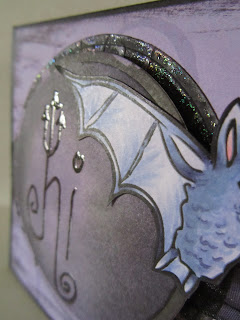
The awesome bat image was drawn by our newest addition to
the dungeon, Andrea! This chick is so talented in so many mediums.
She is quite an inspiration and a fount of new blood for our little gathering here.

The entire DT got to play with some of Andrea's killer
digital images.  There were so many to choose from that I went
totally retro and used an image that she sent to me eons ago! 
I LOVE this little guy!

I also used a Tiddly Inks freebie image for the smudged portion
of my card. I went over it with a Versamark pen and then clear 
embossed it to make it stand out after all of my distressing. I also 
used a circle Spellbinder and embossed it with swirls from my
Cuttlebug folder. Then I added some metallic  purple pigment ink
and heat embossed it with an iridescent powder. 
Note to self: Emboss with folder afterIcutting the image with a Spellbinder. 
Otherwise, you end up flattening your embossing when you
run it through the Sizzix. Duh!

Drop by the Haunted Design House blog and and show
me how easy this challenge was for you!