Showing posts with label monochromatic. Show all posts

Monday, July 28, 2014

Smeared Ink July DT blog hop

Well July seems like just a blip on the map this year.
I can't believe it's almost over already.
The end of the month brings us the 
Smeared Ink DT Blog Hop
So that's a good thing, at least.

The theme for this month's blog hop is
MONOCHROMATIC.   

I chose to work with purple hues. One of my very favorite colors.
I used my new rubber stamp called, "The High Priestess"
from the Morbidly Adorable rubber set, 
sold exclusively through the rubber club at Smeared Ink.

I was so excited to ink up my new rubber, that I didn't really 
consider just how much coloring was involved with this image.
Let's just say it was a bit of a marathon coloring session. 
And a bit of a challenge to keep it all monochromatic. I did cheat a teeny bit by
using some RV pinks to give some contrast to the wings, ball in her hand, and 
the beads in her hair.  
  
Love the skellie kitteh!

I used a white Sakura gelly roll pen to add some highlights.
The highlights help with contrast. I can't express how important
I feel contrast is to successful coloring. You have to have super darks
and super lights, coupled with all of the shades in between for a nicely
colored image. Regardless of whether it's full color or monochromatic,
there should be a full range of  hues to show depth. 
In my opinion, anyway.  

Lastly, I've added a sheer purple bow for some dimension and interest,
given how simple the card ended up. I felt it only
detracted from the image to add any embellies or other crap. 
Sometimes I forget that less is more. Usually, I forget.

Thanks for dropping by today. 
Please feel free to hop along to the rest of the design team's 
blogs, and check out their amazing monochromatic makes. 

Monday, April 21, 2014

Monochrome Goddess of Biro

Today marks the beginning of the second challenge for
Aurora Wings.
The new theme is monochromatic.

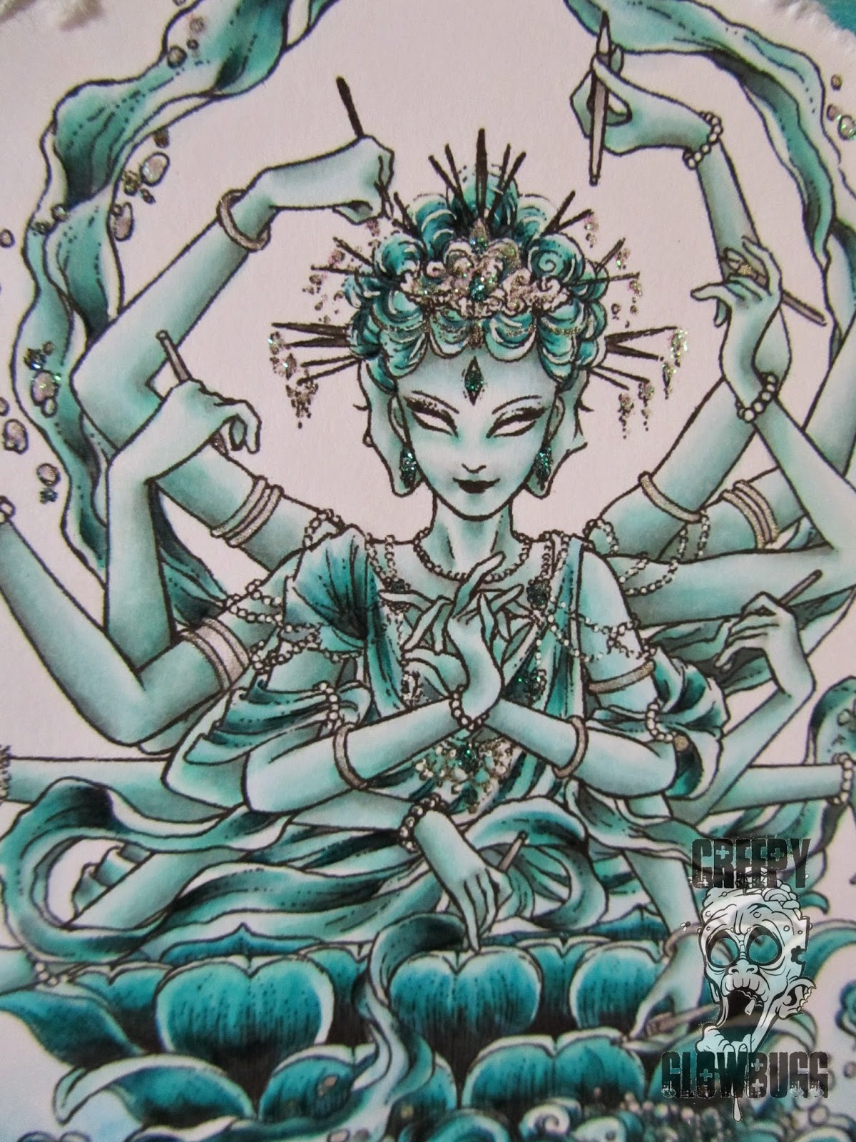
I chose to work with the gorgeous

I started out (after a few previously failed attempts) with an
8x10 canvas, and painted it with various hues of blue green
acrylic paints. I added some distress inked papers with script on it,
and used a matte medium to adhere it onto the canvas.
      
I salvaged an old earring, and added an evil eye charm, 
and a cool, hand of hamsa charm to it, in the hopes of
giving it a Balinese feel. Even though the hamsa is actually
a Jewish symbol, thought to give protection from the evil eye.  

 I added some white pearl acrylic paint accents and Stickles 
to the background, before adding the finished image.


This image is amazing! So much glorious detail (notice the three faces!). 
It was quite a challenge to color in a monochromatic color scheme, 
but I love how she turned out!
I almost ruined the entire colored image when I decided to add some
color to the edges. Total FAIL! Then I had to try and tear the edges off without
losing any of the image, or leaving any of the offensive color mistake.  


Thanks for stopping by!
Please drop by the Aurora Wings challenge blog and
see all of the beautiful DT work for this challenge.


Friday, August 9, 2013

Spooky Monochromatic-ish

Today's Dilly Beans challenge is 
MONOCHROMATIC.
Brings back memories of art class, doesn't it?
I guess if I was actually paying attention in class, I would know that
just by adding the orange into my project, it no longer qualifies for 
monochromatic.
So flunk me.

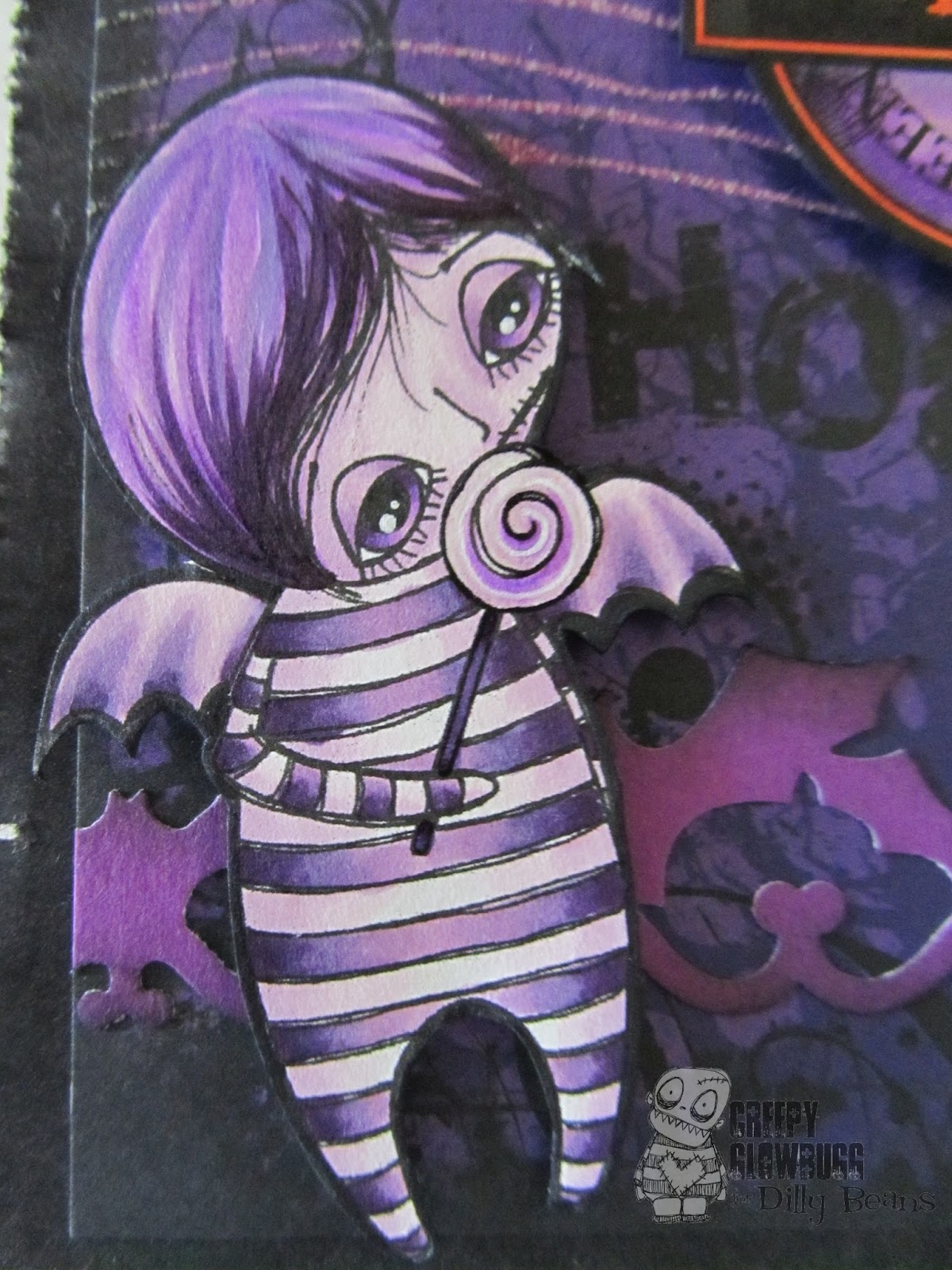
I used #199 Bat Boy Loves Candy image for my 
Hallowe'en scrapbook page. This is the first time I have 
colored this little fellow up. He looks kinda sad.
Or just melancholy.

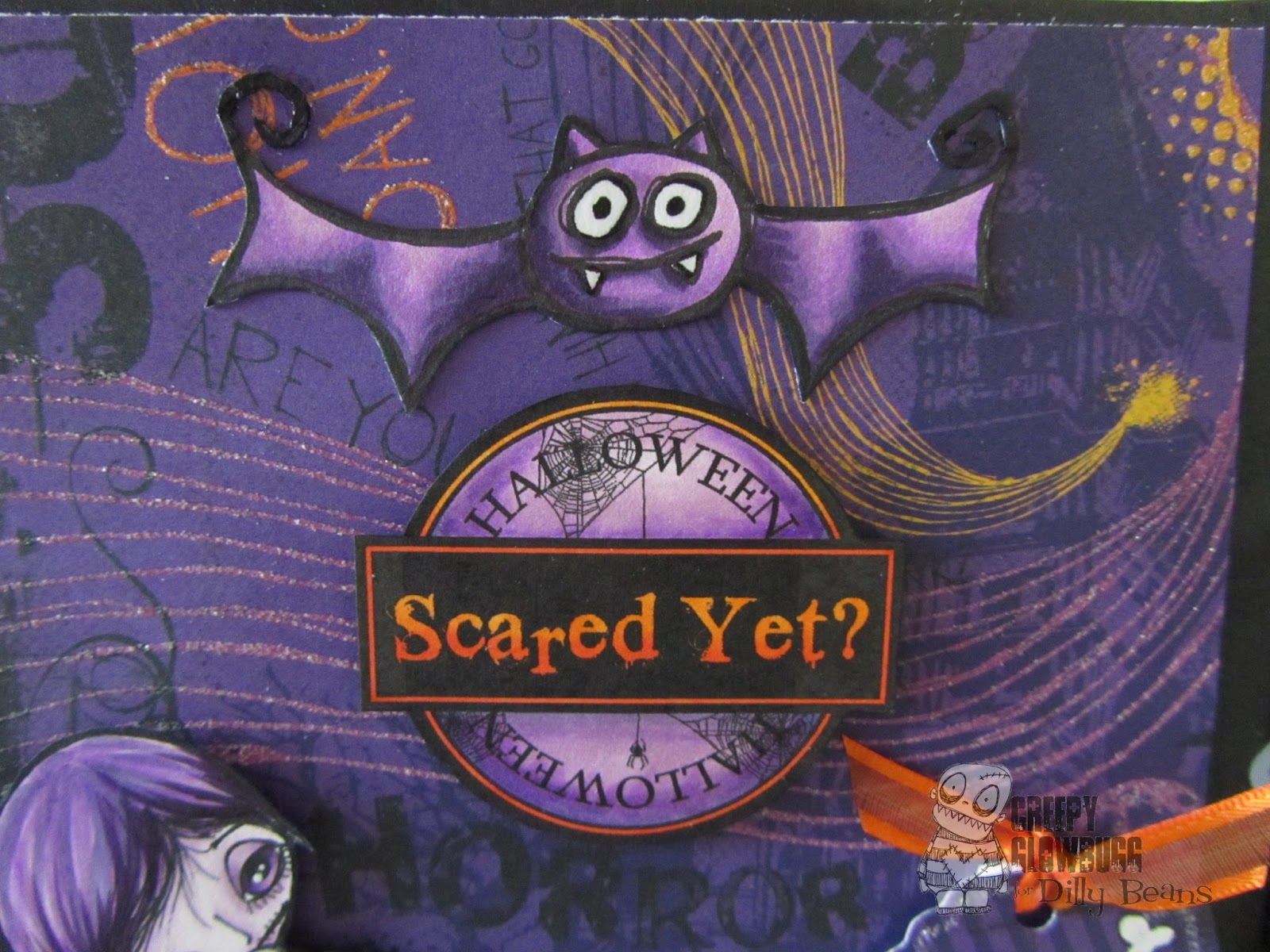
I used #477 Bat for the top of my page.
He works perfectly with the cool badge in the middle.
I finished it all up with a MS punched bat border, a little die cut tag,
and some orange ribbon. Ta-dah!
I'm hoping to finish this black bag scrapbook by the end of next week.
Better get busy!!!

Thanks for dropping by!

Tuesday, May 18, 2010

Hey there, Sweet Pea


Okay, I am coming clean.
I have been covetous of Sweet Pea images for quite a while now,
and finally caved in a few months ago and purchased some of these gorgeous ladies.
I have seen Traci, over at Wicked Pixie and Angela, at In My Quiet Time, bring these images to life with their stunning coloring and artistic skills, and I had to try my hand as well.
Mt first attempts were futile. My coloring really wasn't up to par for these images.
But, with a bit of practice and close-up viewing of other's coloring, I think I've got it!
This is "Purple Woods", by Ching-chou Kuik.
I went for the whole monochromatic color scheme which happens to be the challenges over at Kaboodle blog, and Copic Creations this week.
I think she turned out quite nice.
I used mainly the Violet family of Copics, and added some Primas, and some
Stardust Stickles.