Tuesday, November 15, 2016

SDC: Human with an Animal Head

Sometimes a brilliant, yet simple prompt is all one needs to wake their
hibernating mojo.
The current theme at Stampotique Designer's Challenge is just such a prompt.
What's better than that?

This idea popped into my head just out of nowhere and I knew it
was perfect for this challenge. It was the actual execution of it I was
worried about.

and all of the dog heads from the Dog Cube #6192.
I actually only stamped the necks and partial bodies of the girls, and only
the heads of the dogs, but you get where I'm going here, right?
After fussy cutting out the dog heads, I dry fitted them to see which head
looked best with which body. I think they worked rather well.   

Lastly, I stamped Poochas Gracias #8978  as the finishing touch.
Stampotique has an awesome selection of words and phrases 
for any reason or occasion.
I added some Hickory Smoke Distress Ink behind these gorgeous bitches
and some splatter for an artsy touch.

Don't forget to pop over to SDC to see some inspirational samples from
the ridiculously talented and diverse design team.   

Tuesday, October 25, 2016

Far Out, Man!!

Here it is, nearly Halloween and I have a totally NOT
Halloween themed project for you today.
Since I went back to work after being a housewife for the last
8 years, I have been really slacking on creativity and my mojo
has gone into hiding. I'm so worn out at the end of the day that
I'm usually in bed by 9 PM. I used to stay up all hours of the night
making fantastical things...
I digress.

This tag is for the current theme at Stampotique Designer's Challenge,
"Outer Space".

I kind of struggled with this theme, as I'm not a really
space-y type of chick. BUT, I did want to try my hand
at a galaxy background. 

I created the background using various spray inks like
Tim Holtz and Lindy's. I used the TH distress spray
in black soot to give the tag a base, and then added dark colors
of Lindy's sprays, drying between layers. I topped the darkness
with metallics and some white speckling to represent the stars.

I used Gonno #6203 as my space man. He looks like he's a bit
off balance to begin with, so this wasn't much of a stretch.

I used the Circles Cube #6184 and stamped the one with the
largest open area. It fit Gonno's face and a clear epoxy
sticker perfectly! And now our spaceman has a helmet.

   Lastly, I added some TH stars and some TH alphabet die cuts
to spell out "Space Case". I added some Stickles for sparkle and
more starry illusion. Fini!

Thanks for dropping by.

Be sure to pop by the Stampotique Designer's Challenge blog
to see all of the far out creations made this week.

Tuesday, October 18, 2016

SDC:259 Halloween

Even with my soul stealing employment, I managed to make something 
Halloween themed after all.

The current theme at Stampotique Designer's Challenge is
HALLOWEEN!!!!
It really is the most wonderful time of the year.

One of my new friends is Tara, who is also a newbie on the SDC DT.
She's pretty awesome. And she likes to collect bugs and weird shit just 
like I do. I consider it destiny...
Anyhoo, she wanted to trade pocket letters with the new DT.
This is the one I sent to her. I used all kinds of Stampotique stamps 
on this letter. It was super fun to make. And only my second PL ever. 
It was also a great way to use up some ATC sized scraps of
Halloween papers.

I popped in a quick note and a few tricks and treats to go along with the 
Halloween theme.

Thanks for stopping by.

Be sure to check out the Halloween eyeball candy going
on over at the SDC blog! And have you been by the 
Stampotique facebook page yet? You really should check it out.


Monday, October 17, 2016

AW Anything Goes

Just a quick share today of my DT sample for 

Since I'm already lacking greatly in the Halloween makes this year,
I decided to have a go at making this into a Halloween themed thank you card.
My sister in law just took me to the Sinister Creature Con yesterday.
I think she deserves a nice card.

I used the adorable Day of the Dead Marigold Sprite
Another of my very favorite Sprites.
  I used a card base that was a sample of my new Color Burst powders.
So much fun to play and create with those! The card base already had
spider web embossing on the edges so it worked perfectly with that
Stampin' Up web doily.

 I colored this cutie up using Copics in my Halloween go to colors
of purple, green and orange. Topped everything off with a healthy
does of various colors of Stickles, and this card is ready for the post
office.

Thanks for stopping by today.
Be sure to check out all of the creative eye candy being shared over
  

Tuesday, October 4, 2016

What's my favorite quote(s)?

The new theme at SCD is to use your favorite quote
It is nearly impossible to narrow down my favorite quote
to just one, but I did manage to get the list knocked down to just two.
And surprisingly they are from the same person. And maybe even more
odd, they are from Maya Angelou. I know, right? 
Most may have guessed Edgar Allan Poe or Alfred Hitchcock
or Vincent Price ("I never met a monster I didn't like", is one of my very favorites.),
but Maya's words have always spoken to me on such a personal and fundamental 
level. I first heard her on an episode of Oprah and was struck by how 
beautifully she used her words to speak the truth. I love her.

I can't even begin to tell you how many times I have repeated this quote
to myself and to anyone who will listen. It is pure truth.
And has saved me from getting burned more than once by the same person. 

I used Twinkie #6103 and Topher #6198 to bring this journal page to life.
They are such weirdos and I love them so very much.
I also used some circles from the Circles Cube #6184 to add more interest.

Topher, always the silly weirdo.

And then there is this lovely lady with her "pearls of wisdom".
Perl #6071 is one of my most used stamps, only second to Karin

This quote speaks to me because I have always tried to be
anything but normal. And look at me now!! 
Abby Normal is my constant way of being. 
And I have been known to be pretty amazing at times.

I managed to sneak in some lovely girly-ness using some of the
gorgeous blooms from the Flower Cube 1 #5851. I even heat embossed them in gold.
I have quite a bit of neglected gold powders since I rarely use them. I really love how 
they give a feeling of beauty and fanciness here.

That's it for me today. Be sure to drop by the Stampotique Designer's Challenge
and see what everyone else has cooked up for this fun challenge theme. 

Monday, October 3, 2016

Useless Trinkets Halloween Hop

EDIT: My apologies to my Hop mates and to those of you
trying to hop along in order on Saturday. I didn't get my post
auto posted properly and ended up being the weakest link in this hop.
I hate it when that happens... 


It's that time of year again, when the amazingly talented 
Jessa of Useless Trinkets fame generously shares her art with the 
masses for the incredibly low price of ....FREE.
Yes, you read that right, she gives her art away for free.
Because she's cool like that. 

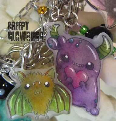
I was inspired by the gathering of multiple new monsters
and my dear DT mate Arwen, to try my hand at making jewelry.
I began with some shrink plastic that I taped to a sheet of printer paper
and printed the new kids in fairly large sizes. Maybe 3 inches high, or so.

I used Copics to color everyone on the rough side of the plastic.
I trimmed all the monsters and bats out, punched the holes for the findings,
and then used a heat gun to shrink them down to size. I added some white gel
pen as highlights for more interest.

I added the charms to a ready made charm bracelet a few links apart
to give everyone space to shine individually.  

Some of the highlights worked out better than others...

I added some silver charms and glass beads to the bracelet
to fancy it up some. And to make it look fuller and prettier. 

I may be wearing this to work next week.

Be sure to hop along to all of the blogs and see what 
fun and creative projects everyone has cooked up with the new
freebies. And don't forget to grab your very own freebies, too!

Me

Monday, September 19, 2016

For the Boys and Men

The new theme at Aurora Wings is 
"For the Boys and Men".
Now, I usually craft with a fairly masculine energy. No subtle colors
or super sappy baby images for this chick. BUT, I do have a problem
crafting specifically for men or boys in mind. So, this theme did kind of
throw me for a moment. Then I remembered that I have been wanting to
color in that adorable Zombie Puppy of Mitzi's. He goes purrfectly with the 
Zombie Kitty that I colored up so long ago here.        

I went with a Golden Retriever color palette for this undead pup.
I also just went for it and started my Halloween cards for the season.
It's never too early for me, ya know. In fact, I'm actually running
a bit behind this year...

I thought the feel of this card was pretty masculine, but I did have to
stop myself from adding some Stickles to the green goo dripping out 
this pup's mouth. Some habits are hard to break.

C'mon, even for a zombie puppy this guy is ADORABLE!!
I colored him with Copics and made sure to make his stitched-on leg
a bit discolored to mimic either a different breed of dog, or just a leg well
past it's "best by" date. 

I used various random Halloween papers from my ever growing scraps box
and collection of Halloween themed papers. And the googly eyes are a new
addition to my "collection". I had to use them in some way. I just had too!
I popped on some die cut bones and a spider web for balance and to add more
lime green to the project.
I think any boy, man, woman, or girl would love this card. And now the seal has been 
broken, so get ready for more Halloween themed projects from now until November.

Be sure to stop by the Aurora Wings Challenge blog and check out all of the 
incredible inspiration projects for this new theme.
  

Tuesday, September 13, 2016

Just put a BUG on it!!

It is no big secret that I have a love for bugs.
I don't mind ones that are alive and doing their buggy business,
but I prefer the dead ones encased in acrylic or under glass.
That way I can check them out up close and personal without
harming them in any way. Or getting stung or bit in the process.

The new theme over at the Stampotique Designer's Challenge is
That was my suggestion for a challenge theme, and how cool that it
was chosen to begin right before my birthday. Yay for me.

I am kind of loving how this card turned out.

I used the bee stamp from the Birds & Bugs Cube #6117 ,
by Daniel Torrente.

This is the very first time I've used the bee, but now he's one of my
favorites. I stamped him three times onto acetate using a rather old and sticky 
Stazon pad. It worked, but I need a new black Stazon pad for future stamping.
Lastly, I glittered him on one side three different times, using different glitters.
I flipped one bee to give me a mirrored image to use as well.
    
In retrospect, I should have used glossy accents and glitter, but I was trying
to cut corners and just used a glue pen as the adhesive. Not as good glitter
adhesion and coverage that way, but it did dry pretty fast.
I used the Tall Word Collage #7167 for the wording. Such a great stamp with so 
many options for word play. 

And for the star of the show, I used Kassa's Bloom #14014.
I heat embossed it in white, and then colored it using TH distress inks and
the mini sponge applicators. My favorite part was splattering water on it
to create all of the bleached out droplets. I used a stitched circle die to cut it out,
and backed it up with some layered doilies.


Bee sure to drop by the SDC blog and check out all of the inspiration
that has been created for this challenge.
Thanks for buzzin' by!!


Monday, September 5, 2016

New beginnings

I am currently in a moment of growth and great transition.
I just started a new job last week. I haven't had a "real" job in over
eight years. I really didn't want to work for "the man" again, but 
he does pay better than most scrapbook shops and co-op type places.
And I really needed the benefits, too.

I know I'm not the only one going through changes.
I have had a friend on my mind a lot lately. She is kind of the living
representation of the "what doesn't kill you only makes you stronger" ideal.
I wanted to make her something to commemorate her two years of sobriety.
That's a really big deal. Really big.  

I decided to make a wall hanging using a canvas panel.
She has a thing for chickens, so I thought this was a good 
time to break out with some of my Unity stamps.
I've used  the Chicken Wire stamp and the New Day Rooster set.

I painted the canvas panel using black acrylic paint,
and once it was dry I stamped the chicken wire in VersaMark
and silver embossing powder.    

I used a burlap sheet, a clock die cut from a Tim Holtz die,
and some distress inked paper for my focal points. 

I also added some actual chicken feathers, some designer papers,
doilies, die cuts, sequins, seam binding, and wire mesh to give a
rustic country feel to this piece. 

After mounting the rooster to the die cut frame, I used Crackle Accents for a 
vintage look. The CA kind of reactivated the Distress Inks and changed the look
a little bit, but not too bad. I edged the oval with Platinum Stickles along
with a few other pieces. I like the look of mercury glass, and this
shade of Stickles gives me that effect.   

Overall, I'm really pleased with how this turned out.
Sometimes, mixed media has a way of taking on a life of
it's own. I think this one wandered away just enough to make it
interesting.

Thanks for stopping by today.

I'd like to enter this wall hanging in the following challenges:


New beginnings

I am currently in a moment of growth and great transition.
I just started a new job last week. I haven't had a "real" job in over
eight years. I really didn't want to work for "the man" again, but 
he does pay better than most scrapbook shops and co-op type places.
And I really needed the benefits, too.

I know I'm not the only one going through changes.
I have had a friend on my mind a lot lately. She is kind of the living
representation of the "what doesn't kill you only makes you stronger" ideal.
I wanted to make her something to commemorate her two years of sobriety.
That's a really big fucking deal. Really big.  

I decided to make a wall hanging using a canvas panel.
She has a thing for chickens, so I thought this was a good 
time to break out with some of my Unity stamps.
I've used  the Chicken Wire stamp and the New Day Rooster set.

I painted the canvas panel using black acrylic paint,
and once it was dry I stamped the chicken wire in VersaMark
and silver embossing powder.    

I used a burlap sheet, a clock die cut from a Tim Holtz die,
and some distress inked paper for my focal points. 

I also added some actual chicken feathers, some designer papers,
doilies, die cuts, sequins, seam binding, and wire mesh to give a
rustic country feel to this piece. 

After mounting the rooster to the die cut frame, I used Crackle Accents for a 
vintage look. The CA kind of reactivated the Distress Inks and changed the look
a little bit, but not too bad. I edged the oval with Platinum Stickles along
with a few other pieces. I like the look of mercury glass, and this
shade of Stickles gives me that effect.   

Overall, I'm really pleased with how this turned out.
Sometimes, mixed media has a way of taking on a life of
it's own. I think this one wandered away just enough to make it
interesting.

Thanks for stopping by today.

I'd like to enter this wall hanging in the following challenges:


Tuesday, August 23, 2016

Stampotique wants your polka dots

I've got a new project for the theme of 
POLKA DOTS
Ever since I got these stamps, I've been scheming as to how I was
going to put them all together on a card. 
I think I pulled it off.

I used the new release of Marsha #6209 and coupled her with 

I added some wave die cuts made of vellum, and colored the backs of them using Copics.
I was going for a rancid fume look.

And to top it all off, I used the incredibly useful Pull My Finger #8966
stamp to really drive home the idea that Marsha is up to no good. 

Something tells me she is going to give this skunk a run for his money...

I backed this odoriferous scene with a lively orange polka dot paper to
stay within the guidelines of the current theme.
Be sure to pop by the Stampotique Designer's Challenge to see what the other
ladies have cooked up for this fun theme.