
So, about halfway through my painting for the
Drop Dead Gorgeous
challenge at Haunted Design House,
I realized I don't really have a clue what I am doing!
I'm no painter! How do I blend colors? What's gel medium used for?
Which brush should I use? Ack!
She's turned out pretty good considering, I guess.
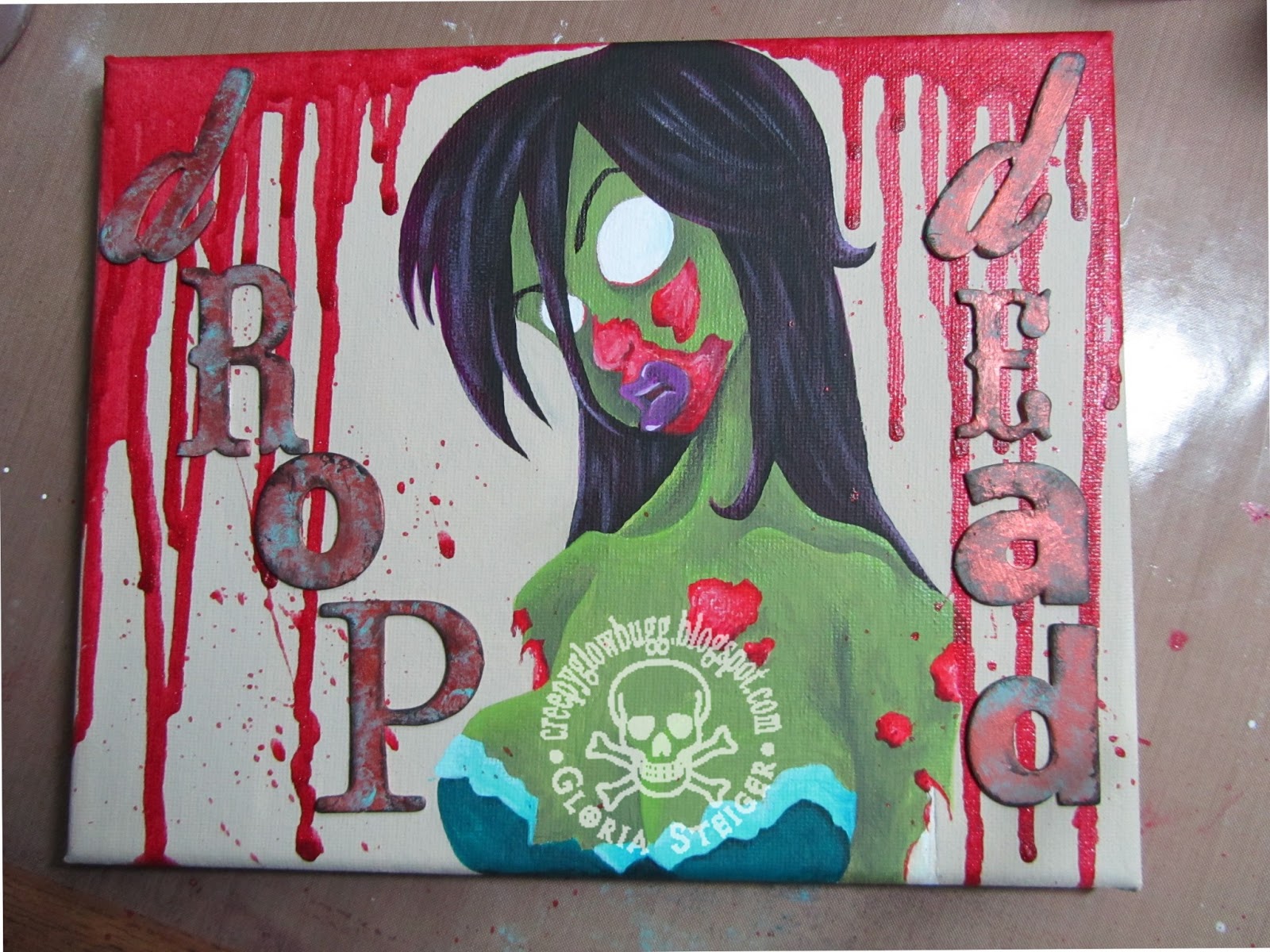
So this was the original idea, using chipboard letters to spell out
Drop Dead.
My son put the nix on it, and said it detracted from the painting too much,
making it look "scrapbooky". I rely on his opinions quite a bit. He's got a
good eye for color and design.

I want to also state that this is not my original concept.
I found a really cool sketch on Deviant Art a few years (long before I
became so diligent about saving artist's names with their art),
and sketched it into my ideas book.
I scoured about 80 pages on DA for this sketch yesterday, but couldn't
find it. I just wanted to be clear that this is not my concept, but rather my version of the original sketch.
This version was before the final (for now), fine tuning.

The more she sat on my table, the more I kept messing with her.
Is that how most paintings are? The more you look, the more you want to
fix and add to it?
I had to stop. I still want to fix her nose and lips, but I have to stop.

Feel free to stop by HDH and get your hands dirty with our latest challenge.

