Tuesday, May 31, 2016

Rudy makes an appearance

I just can't get enough of the Stampotique seahorses

Today I am showing off Rudy.
He's awesome in a totally wonky way.
I love Daniel Torrente stamps from Stampotique for this very reason.
All of his drawings and characters are superbly WONKY.   

I made this ATC for the current challenge of Sea Creatures
I used a water colored background, and added Rudy hanging 
onto some plant die cut like he would be in the wild.
I sparkled it up a bit using some Lime Green Stickles and some
opalescent sequins to serve as bubbles.
He goes great with the ATC I made the other day using Reggie here.

Monday, May 30, 2016

I couldn't resist...

I am so in love with Power Poppy images that I just had to
squeeze in one more card for their current challenge of

I still haven't had a chance to work on the beautiful
Foxglove and bees image, but I did manage to complete
another sunflower card.

This time I went with a standard color scheme and a slightly
masculine feel for the card. I wanted to try a different background technique,
but I keep forgetting to do that part first. As usual, I have used Copic markers 
to color in the image. I couldn't resist adding some Cinnamon colored Stickles 
to the center for some bling.

I moved the sentiment a little on this one, so it
didn't look so crowded. I love how they provide beautiful
sentiments with their gorgeous images. 
I kept the card super simple with a tiny twine knot and that's 
pretty much it. These images don't need a whole lot to make
a beautifully finished card.

I'm entering this in the Power and Spark challenge of May flowers

I'd also like to enter it in the following challenges:


WW Sea Creatures

I have been inspired yet again by
to create an ATC featuring a Sea Creature this week.

I kind of adore Reggie the seahorse from Stampotique.
He has friend named Rudy who will make an appearance tomorrow.
I colored Reggie using my go-to coloring medium of Copics.

I colored the background using Distress Inks in Peacock Feather,
Shabby Shutters and Tumbled Glass on TH watercolor paper, hoping
for a underwater feel. I spritzed it with water and dabbed off the excess for those cool 
water drops everyone likes so much. I stamped some Seaweed onto the background
and colored in the dots with a white Posca paint pen, and then added Waterfall 
Stickles for some sparkle. I popped Reggie up with some foam tape, and then
glued some sequins on to emulate bubbles.
I am loving how this one turned out. I had so much fun I made another ATC,
but I'm saving it for tomorrow's post.

Thanks for stopping by!  
I'd like to enter this ATC in the following challenges:


Wednesday, May 25, 2016

The Power of the Poppy

I was perusing YouTube the other day and watched a wonderful coloring tutorial 
by Jess C of a gorgeous sunflower image from Power Poppy.
I had never heard of Power Poppy before, so of course I popped over
and was blown away by Marcella Hawley's gorgeous artwork.
I recognized her art immediately as one of my favorite Hallmark card
artists. My Grandma always gave me Hallmark cards by Marcella, so I knew
who she was at first sight. I was so excited to think she was now sharing her
incredible botanical artwork with crafters through her rubber stamps and digis.
I picked out two of my favorite images to buy, but I will be collecting them all
as my budget allows. I opted for the digital versions as I like the instant
gratification of receiving them ASAP, and the ability to resize and manipulate as needed. 

After being inspired by Jessie's tutorial, I colored the sunflower image first.
I love how it can be colored any color, not just yellow. I chose to go with
the RV color family like Jess. I used RV69, 19, 09, 06, 04, and some RV02.
I even threw in some C grays for shading, but probably won't do that next time.    

The C's gave the petals a bit of a purple hue, but I felt it wasn't
really needed by the end of my coloring. I have to admit that this image
was a dream to color up. Plenty of detail, but not so much that it took hours
to color everything. I also added some background shading using a dot technique
to give some contrast against the white background.    

Since the flower really is the star of the show, I just matted it up on some
SU Razzleberry and some black card stock, and then popped it on a white card.
I am really into the whole sequin thing right now, but this is the first time I actually
used them on a card. I like how this one turned out. CAS, but yet quite striking. 

I plan to color up the Foxglove image next. It's got Marcella's fabulous little bees in it.
Such a beautiful image. Lots more details and flowers to color on that, one so it may
take me a while to get that one done.

I'd like to enter this in the following challenges:


Monday, May 23, 2016

Wee Batty Boos

I am back today with another Halloween themed project.
Today I have an ATC inspired by a Pinterest pin for the current

 This is my pin from my Color Theory board on Pinterest.
I have a bunch of them (87 to be exact) saved on my board,
but this one really popped out at me for some reason.  

I have had this adorable image from Wee Stamps for quite some time and this is the
very first time I have colored these cuties up. I know, how lame, huh? 

I used the oranges, the blue violets, and the red violets from
the color theory palette. I added the yellow green to ground the image and provide
more contrast. I was trying to stay away from grays because the cool grays 
look very similar to the blue violets used on the bats.

I used an ombre effect to color the button stamp. Another virgin stamp
used finally. I also popped some yellow glitter in the pumpkin's eyes and
mouth for a bit of interest and sparkle.

Super sweet image I'm glad I finally colored.
I really like this challenge of Pinterest inspiration, but getting
to choose your own pin was really fun. I may have to make that a weekly
occurrence for my own personal challenge.

I'll be back tomorrow with yet another card for you to check out.
This one isn't Halloween in nature, but I hope you'll pop by and 
check it out anyway.

I'd like to enter this ATC in the following challenges:


Sunday, May 22, 2016

The Evil Has Returned!!

Like a bad penny or a demonic doll, the Minions have returned
 to unnerve and amaze you with our dark spin on arts and crafts.

With nothing but tricks and bugs up my sleeve, I have managed
to create a project that has been haunting my brain space for years.
Yes, YEARS! I have been collecting, hoarding, and pilfering
bits and bobs for this particular project forever.
Ready?

I have finally created a Haunted Design House of my very own!!
Pretty fuckin' cool, right?!!

The little house started out pretty unassuming. 
I picked it up at my local thrift store, and painted it with gesso to give me a nice,
clean base to begin my wicked handy work.  

After a bit of deliberation, I opted to go with an overall crackle effect 
using DecoArt Weathered Wood crackle medium. I have hit and miss success 
with this product. You have to be very quick when applying the top paint coat,
and be sure to NOT go over the same place twice, or the crackle will not happen. 
In the end, I am pretty happy with the crackle, but was hoping for all of it to be 
perfection. Must be the Virgo in me...
The roof was created by using Golden resin sand to give an awesome texture like all
haunted houses should have. In retrospect I should have mixed black acrylic paint 
into the medium to save myself the step of painting the roof black afterward. 
Now I know for next time.  

After the roof was dry, I applied Inka Gold metallic rub in green/yellow.
I thought this would give the appearance of a rotten moss covered roof.
I added some fun plastic skeleton hands on the roof for a creepy carnival feel.
I used a heat gun to soften the plastic and shape them to look as though
they were grabbing the rooftop. I adhered them with trusty E6000. 


And now for the fun part. The embellishments! 
I had a shit ton of Halloween papers and google prints to choose from in my stash. 
Each room was carefully planned and decorated accordingly.
I used matte medium to apply all of the paper pieces.

Everyone knows that bats always inhabit the attic of every haunted house, right?
My is attic is actually a bat museum though, as the sign clearly states. 
I added a woodcut bat, some paper punched bats with clip art heads, 
and some plastic Halloween tree clippings.
I sprinkled mica flakes and glitter from Finnabair on the floor, and then decided that they
kind of looked like fall leaves, so I added some flakes to the branches as well.

The anatomy room is on the next floor. Complete with a hand painted skull,
a mummified pig fetus specimen, a vampire jaw charm, and a random bottle of gold elixir. 
Various diagrams and a brain on the floor are a necessity in all anatomy rooms.    

This room is the "Spook Show" room with spook show posters, a shiny jack-o-lantern, 
and of course some ghosties. I sprinkled some MS glitter on the floor for some sparkle.

No haunted house visit is complete without a proper palm reading.
I cut off a Barbie hand and glued it under a TH dome. I love that detail.
I used some Tarot cards and a palm reading chart to decorate the floor
and walls. And there are a smattering of spider die cuts scuttling around as well.   

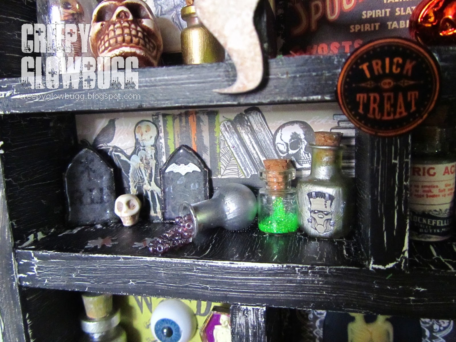
The next floor houses the apothecary rooms.
This one has some fun two-headed taxidermy cut outs and more jars of schtuff. 

This one has some MS punched tombstones, a teeny skull, and some 
jars of monster makin's. I love how the spilled jar of microbeads looks.
I used matte gel medium to suspend the spilled beads.  

The bottom floor houses the headstones and coffins.
More gel medium and seed beads for interest.
The coffin and headstone are from Michaels miniatures that they sell 
at Halloween to go with their Halloween Town collection.  

A jar with a human eye, and a fun eyeball and crossbones adorn the 
back wall. The teeny coffin and skellie wouldn't fit in the coffin room, so it
found it's way in here. More MS glitter and spiders on the floor.  

And finally, the twins' room! 
I used a cool Siamese Twins cabochon and some left over paper cuts here.

Well, I have to say that it feels so good to finally get this creation out of my head. 
It's been taking up so much space in there!
Thanks for letting me take you on a tour. It was fun for me. How about you?

I hope you'll pop by the Haunted Design House 
to see more of what's been haunting the Minion's thoughts lately as well. 
We missed having visitors despite what the trespassing signs may indicate... 

I'd love to share this with the Dark Attic Challenges - Anything Goes


Monday, May 16, 2016

Aurora Wings CAS

Today is the start of a new challenge at Aurora Wings.
The new theme is Clean And Simple (CAS).
Honestly, this is my preferred way of creating with the gorgeous
images of Aurora Wings. Once I finish coloring an image, I am usually at
 a loss as to how to assemble a card around it's detailed beauty without
detracting from it.

I had a bit of an epiphany, and edited some of the more involved images
using Gimp. I chose the focal point I wanted to highlight and cropped the image.
Sometimes I am intimidated by the images with so much detail that coloring
seems like a never ending process. It usually takes me at least an hour (usually longer)
to color an image. So, the thought of coloring one image for hours seems a bit daunting.  

I love the Santa Muerte image, but I have always been too scared to try and do it
justice with my coloring. I found the face to be the most beautiful part, so I cropped her
face to give me the impact I needed for a perfect CAS card.  

I still toiled over which colors to use and how to use them, but it
took me less than two hours to create this entire card, which is pretty good for me. 

 I am actually quite pleased with how this worked out and am eager to 
make more CAS cards using cropped Aurora Wings images.
I want to use the dragon from the 'Dragon Lore' image next.
Keep an eye out for that one. 

Be sure to stop by the Aurora Wings challenge blog to see all of the 
inspiring CAS samples the design team has created for this theme. 
They're stunning!

Saturday, May 14, 2016

F is for ....

...FUGLY.

I have received the esteemed honor of being crowned the 
Queen of Snark 
by the Sisterhood of Snarky Stampers.
Along with my shiny new crown I get to guest DT for this week's challenge.
When it comes to fugly (so ugly it deserves an eff in front of it) I have no shortage
of unattractive papercrafting supplies. I have a ridiculous amount of ugly ass papers.
You know when you buy a paper pad for that one or two gorgeous sheets of paper,
but then the rest of the pad is inundated with just blech?! Yeah, I have a bunch
of those. Especially old papers I've had for years but never seem to part with even on
my best purge days. This was a perfect opportunity to part with some of those papers.
The hard part was deciding which ones to try and work with for a usable card.

These papers came in a set that I bought at Ross or somewhere.
Most of them have glitter and embossing and are in the purple range.
These however are not purple, but at least they play well off of each other.
And for the record, baby blue is probably my least favorite color ever.

This guy on the other hand is one of my favorite images.
He's 'Gobsmack', from Sweet November. Sadly, I don't think he's available any longer.
He does however go fabulously with the snarkiest of sentiments.
I used some new stamps from StudioL2E and Snarky Stamps from Paper Issues.
Thanks to my new Snarky Sisters, we were able to share links to some new stamps
for each other. Snarky Stamps from Paper Issues are awesome! Lots of cursing,
so be warned if you choose to check them out. The same goes for StudioL2E.
My buddy Jessa from Useless Trinkets was kind enough to hook me up with
the 'Potty Mouth' set as a gift. She rocks. I had to expand my collection with the
'Suckyday Part-1' set as well.  

The inside sentiment is from the Snarky Stamps 'Ahh Real Birthday sentiments',
which are currently on sale. It looks like they may be phasing these sets out, 
as they are all on sale now. Grab 'em while you can!! 

Overall, this card is pretty cute. I managed to use up some papers that I thought
were basically unusable, and they do work well together. 
Even with baby blech. I mean baby blue. 

Well, that's gonna do it for me today.
Now to narrow down who to send this fugly little gem to for their 
special day. The list is long since I have a lot of good humored people in my life
who will totally appreciate this card.

Thanks to the fabulous ladies at the Sisterhood of Snarky Stampers.
They get me over there. Check 'em out!! And join in on the fugly challenge
going on right now. Just do it. All the cool kids are there.


Tuesday, May 10, 2016

Debbie Downer

Mother's Day just isn't what it used to be since my Mother died.
It's been three years and I felt like I was going to okay, but I wasn't.
I spent time making Mother's Day cards and gifts for the wonderful and loving
women in my life, but when Sunday morning came around, I found myself
to be melancholy, foul tempered, and even inconsolable at one point. 
Man, I hate that. I hate being such a Debbie Downer. It's really not my style.
But it happened, and it will probably happen again next year.
So I decided to drown my sorrows in my art journal.

I began with two Stampotique stamps I have yet to ink up yet,
They remind me of a mother and daughter, so I felt they were fitting.
And my Mom and I are rather dark and weird, so it works.

I colored Tetewea in sepia/YR Copic tones to give the feeling of 
an image from the past. I used a frame die cut and doodled on it using
 a Sakura Stardust Gelly Roll pen.  


Then I did a bit of journaling. Nothing too deep,
but it gets the point across that I miss my mom. A lot.

I gave L'il Tatawea red hair like mine, and colored her to match those
hideous background papers I was trying to use up. I actually like the way
they all work together now in this layout.

Lastly, I stamped out 'Daniel's Hearts', colored them using
red and black Copics, and then fussy cut them all out to scatter
around the layout to covey all the love that is still there between us.   

I'd love to enter this in the following challenges:


Thursday, May 5, 2016

Punny Veggies ATC


I don't get to play along with Wicked Wednesday ATC challenge
very often. Nor do I get to use these super cute veggie digis very often either. 
So when I saw that the current theme at WW is "Fruits and Veggies",
I made it happen.

After coloring up both the radish and the carrot, I grabbed some
watercolor paper and laid down some TH Distress inks using my aqua brush.
I thought that wasn't enough interest, so I over did it with black and white 
Dylusions splatters and some Platinum Stickles. I kind of wish I had
stopped with just the watercolor background now, but oh well.
I hand wrote the punny sentiment, and edged the entire ATC with Crystal Stickles.
Pretty quick and very fun to make.  
The images are from The Doodle Garden, 
but I can't find a current shop for them anywhere.
I guess Jennifer Nilsson only creates images for licensing now. 
That's too bad for us crafters, since her images are so flippin' cute. 

I'd like to enter this ATC in the following challenges: